In the vast digital landscape that has become so important to our modern society, a website serves as both a digital billboard and storefront for any individual or business. It’s where first impressions are made, where creativity is showcased, and where connections are deepened. As someone in academia I am deeply entrenched in creative research, and I’ve always viewed my website as more than just a portfolio—it’s a reflection of my journey, my passions, and my evolving areas of exploration. Even this blog serves to express and showcase my love for what I do through the written word.
However, in the years since my last overhaul, I couldn’t shake the feeling that my website wasn’t doing justice to the breadth and depth of my creative endeavors. So, I decided to start an expansive revamp of my digital portfolios, with the goal of minimizing scrolling, showcasing more work, and maximizing the impact of my work.
The most noticeable update to my website is the expansion of the areas of my creative research. While my previous iteration certainly highlighted some of my projects, I felt it lacked the ability to expand and failed to capture the full spectrum of my interests. Thus, the first order of business was to redefine and expand the categories that I would feature on the site.
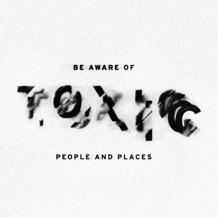
From studio art to experimental typography, from interdisciplinary collaborations to digital art, each facet of my creative exploration now has its dedicated space. Visitors to my website will no longer need to endlessly scroll to uncover the depth of my work; instead, they’ll be greeted with a clear and concise navigation and categories that invites them to delve deeper.
But the update isn’t just about reducing scrolling—it’s about inviting visitors to engage more deeply with my work. Alongside each series or project, I’ve provided additional context and insights. Whether it’s a series of drawings inspired by pain and despair or client project exploring the medicinal branding, each entry serves as an invitation to explore and learn more about what I do. Also a new lightbox is being used that show cases the work in a larger size and allows for easier navigation through the work.
In addition to better organization and additional details, I have also added new work and will be adding even more work over the coming weeks. I have quite a few new projects in process and I’m excited to showcase these. With that said many are drawings (or paintings!?) and those will take some time to upload due to the need to scan/photograph.


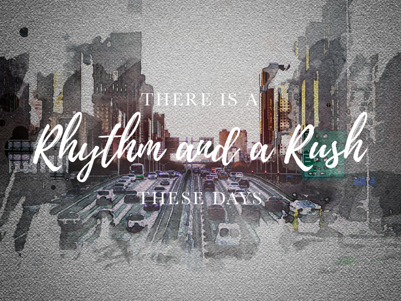
I have also added a digital art section to the site where I have put many of my collaborations with colleagues as well some artwork created utilizing only digital media. Per request from a friend and few students I have added a section for my 10 minute daily exercises which also showcase some of my digital art skills but in a much more rushed and technical sense.
